
Well, let’s be frank, we have all been there. Imagine, you get to a site full of great potential and opportunities, but to locate what you need is as difficult as trying to find a needle in a haystack in a poorly-lit room.
Indeed, when it comes to user experience, modern website navigations are not a mere add-on; it is the first gesture of the host towards the guest. Well the good news is it is possible to design a website that is both easy to navigate and provides a pleasing aesthetic experience with the leading web design company Florida or an offshore software development company. And in this article we will focus on the modern website navigations best practices of the year 2024 to make your site as user-friendly and engaging that will force people to revisit the site again and again.
What is Modern Website Navigations?
Let’s take a closer look at what makes the concept of seo friendly websites so special. We all despise the feeling of being lost in a seemingly aimlessly designed website which is quite like a garage sale where you want a particular item you know is available but where is it?
Modern website navigations play the role of the website’s guide. It is a combination of menus, buttons and links which silently lead the visitors in achieving their perceived goal of searching for information, products or services.
For instance, take it as a well-designed library, the layout is intuitive, categories are clearly labeled, and finding a specific book is a breeze. Modern website navigations are not just about moving the user from one page to another, it creates the environment of organization and priority of the links on the site and their connections. It also saves the user a lot of time, and cultivates that sense of trust and familiarity with the advertised brand. Additionally, seamless modern website navigations are a crucial element in web app development services, ensuring that users can interact efficiently with the application. Plus, if search engines can effortlessly crawl and index your site with the help of your navigation bar, this also makes an impact on SEO. In short, it is the faceless driver that can entice the visitors and make them revisit the sites.
Modern Website Navigations Best Practice and Examples:
Finally, the process of the creation of the users’ experience and interface can be concluded as the crucial aspect of the UX design, namely the modern website navigations. It ensures that every visitor is enabled to search and find the information needed on any given website, which has a significance on the effectiveness of the website in question.
Here are eight of 2024 modern website navigations best practices and examples that will not only guide you on how to improve your website but also streamline your website navigation:
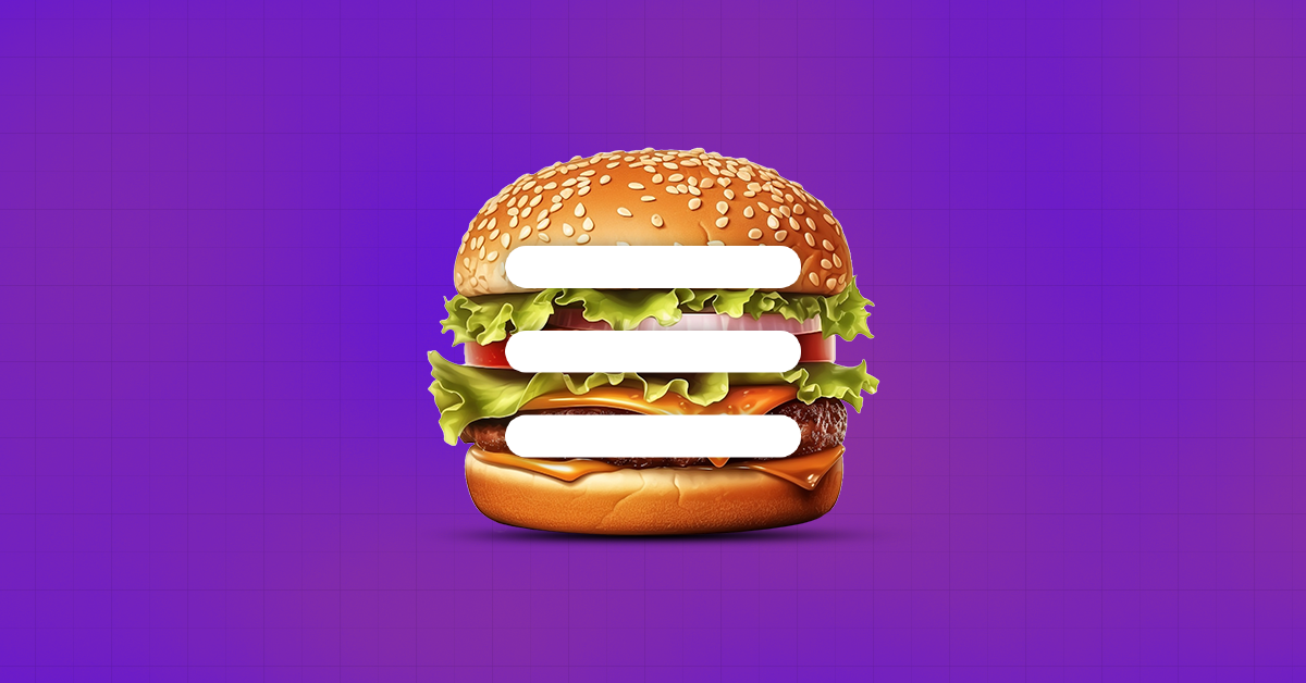
- Hamburger Navigation
Today, a hamburger menu button is a familiar element in applications and websites created in mobile and minimalist design. It is one of the modern website navigations with the aim of minimizing the overall space occupied by the major navigation to accommodate other important elements such as search boxes across websites and applications. It has an identifiable commercial logo that is represented by three horizontal lines resembling a hamburger.
Best Practices:
- It is good to ensure that the symbol is easily recognizable and distinguishable from the other icons.
- For whatever purpose you indicate the existence of a new section, use the hamburger menu throughout the website or application.
- Adding little animation when the menu is called, when it opens and when it is closed to enhance the experience of the users.
- Ensure that the screen readers are informed about roles and labels used by the hamburger menu.
Examples:
- Facebook Mobile App Design: To join different parts together, including the groups on the right, saved items, and settings, Facebook’s mobile app employs a hamburger menu.
- Google Maps Design: As for navigational features, Google Maps employs a rather conventional hamburger menu to store your “Your Places,” “Timeline,” “Settings,” and other elements. One can easily identify where the primary navigation buttons and the searching section are located.
- Design of the Amazon Mobile App: The icon with multiple lines arranged horizontally, known as the hamburger menu, is employed by Amazon to cover a very broad array of options, including individual accounts, customer service, and orders. These are the three permanent panel tabs: Home, Search and Cart.
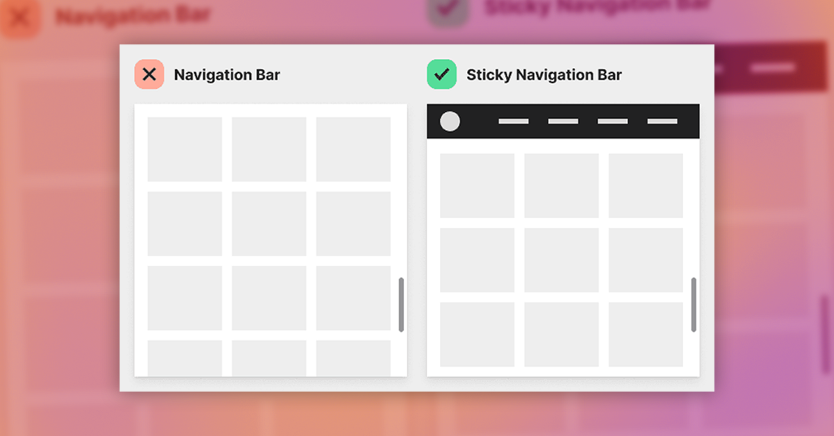
- Sticky Navigation Bars
In modern website navigations, fixed or floating toolbars are those nav bars that do not go out of sight when users scroll down a webpage or an app; they stay at the top (or bottom) of the screen. This design feature, often utilized in custom mobile app development, ensures that users have constant access to some of the most crucial navigation options without needing to scroll to the top of the page repeatedly, thereby optimizing user experience.
The Best Practices
- Reduce Usage of Space: It is preferred not to make the sticky bar too bulky vertically, because that could just as easily be a distraction from the main content.
- Because of the current appearance and functionality of the bar, only the most relevant options should be provided here.
- You should also ensure that the sticky bar is equally effective when being viewed on one screen or another, being optimized to adapt to the different resolutions of screens and devices.
- This type of navigation bar stays fixed at the top of a website’s page and is an excellent example of Sticky Navigation Bars.
Example:
- Apple Design: Currently there is a navigation bar placed at the top of the Apple’s webpage, which remains visible throughout the page and takes relatively small space as the page is scrolled downwards. The primary menus important for navigation consist of “Mac”, “iPad”, “iPhone” as well as “Support”.
- Twitter Design: homepage timeline, search, alerts and messages one has to turn the application on and swipe to the left.
- Adaptive Navigation
Developing multiple website versions that are tailored for different categories of gadgets, such as a desktop, tablet, or mobile equipment, is known as adaptive navigation. Based on the type of device detected, this method presents several layouts and navigation structures, making it more personalized, reflecting the principles of modern website navigations design.
In ecommerce development, adaptive navigation plays a crucial role in ensuring that users have a seamless and optimized shopping experience across all devices, enhancing both usability and conversion rates.
Best Practices
- Ensure that all the devices get to have access to the most crucial navigation options.
- You have to see how well the interface navigates across many screens and devices to be sure whether it is usable.
- This contributes to a reduction of HTTP requests and the maximization of assets to optimize the loading time.
- The last guideline to be adopted states that branding and UI components must remain responsive across all iterations.
- Accessibility: Ensure that these two facilities, the keyboard and screen reader, support the navigation.
- Breadcrumb Navigation
Another patterning technique is a hierarchical one, which provides the visitor with information about the location of a certain page within the framework of a particular website – this technique is called breadcrumb navigation, a key element of modern website navigations. It runs across the top of a page and provides a line highlighting where the user is currently by showing each specified step from the homepage to the current page, and clickable steps facilitate easy navigation.
Best practices:
- Positioning and Visibility: On the top of the page, it is also necessary to place the breadcrumb navigation, preferably, above the main body of the content and below the header.
- Breadcrumb Design: The last step is something more related to graphic design: As the breadcrumbs are immediately supposed to let users know their place in the website hierarchy and should be easily clickable, they have to feature consistent and readable visual design.
- Ensure all the elements in the breadcrumb trail are hypertexts so that anybody can quickly access any level above the current level.
Example:
- LinkedIn Design: For example, to direct users where they are coming from on their profile, LinkedIn prevails to the breadcrumb navigation option, thereby providing users with areas such as Home > My Network > Connections.
- Search Driven Navigation
Specifically, in search-driven navigation, users identify and utilize relevant content or features in a website or application mostly through a search bar. This approach involves the user inputting terms or questions into a search bar, which then offers members relevant suggestions or results. A professional web design company ensures that this feature is seamlessly integrated into modern website navigations, enhancing efficiency, user satisfaction, and ultimately improving the website conversion rate.

Best practices:
- Including the search bar anywhere on the interface with any viewport, ensure it is easy to see at first glance. This is normally in the header or navigation part of the layout.
- Suggestions & Autocomplete: Applying auto-complete features to help the users decide on the best hash-tagged search-terms to type in the search bar and also to recommend several hash-tagged search terms based on the frequency it is searched or used frequently by the users.
- It must offer even higher search levels of relevance to refine search options according to categories, dates, places or other specific relevance factors that could minimize search results.
- Perform search analytics to look at user’s actions or their search queries in the system to find out the subjects that are commonly searched or areas of the website where more optimized navigation could be provided.
Example:
LinkedIn Design: As a way to help people to sort through the myriad of accounts, jobs, and information that they might be interested in, or professionals that they are connected with, LinkedIn uses the search-based model of interaction.
- Footer Navigation
A less important part of navigation but still mandatory for well-structured and informational websites, footer navigation offers additional links, tutorials, and other options to main navigation. In modern website navigations, particularly with micro-frontend architecture, footer navigation can be designed and managed as an independent component, allowing teams to implement and update it seamlessly without affecting other parts of the website. The footer navigation, which is the fixed or semi-fixed bar that can be found at the bottom of the web page, has benefits such as enhancing usability, providing convenient access to links relevant to visitors, and enhancing branding, among others.
Best Practices
- According to the Clear Hierarchy Link principle, the focus should be primarily on the top and further links of the company.
- Consistent Design: By maintaining strong and uniform characteristics such as the fonts used, the colors, and spacings on the site in relation to the general layout, the site can maintain coherence and usability.
- Comprehensive Content: For other link types, depending on which links may be necessary to fulfill user needs or accommodate site functionality, incorporate contact information, social media links, compliance information, terms of service, and other frequently asked questions.
- As for functionality, it is necessary to keep the ability to navigate to the footer sections from any mobile device, and the footer links should look appropriate when placed on different screen resolutions.
- Accessibility: Ensure adequate color contrast and semantic HTML usage and provide keyboard control for all links like offering ARIA roles for suitable layout.
Example:
- Shopify Design: The links to articles, help center, apps, shops, terms of services, and contact details are available at the footer section of Shopify.
- BBC Design: You can access other services in BBC news by going to their footer where you will discover links to BBC news, sports, weather among others.
- Contextual Navigation
If you depend on the content of the material, that is, where the content is located or the movements, which are used by users, then this is called contextual navigation. It is a vital aspect of modern website navigations, especially useful for informational sites that require a visitor’s intelligent flow through a variety of pages and sections while maintaining the site’s openness and usefulness.
Best Practices:
- Display related articles or products based on what the content of the current page is now or based on the user activity with the help of quick view.
- Create pull-down menus or contextual menus that change depending on the section of the site discovered or the page being read at the time.
- Use internal links appropriately throughout the content; It becomes less challenging to guide the readers to other items, publications, or subjects.
- Allow vast selections for a search and to filter through either by le or under the users’ choice or type of information displayed. This will enhance capability to search content more specific to a task at hand.
Example:
- YouTube Design: The contextual video navigation is implemented in YouTube and causes recommendations based on the viewed videos.
- Mega Menus
Mega menus are large menus with several subtopics and options displayed when clicked on a parent or a main tab. They are most effective for commercial sites particularly internet-based businesses and sites with large populations of rather informative-oriented, that is, mere content, categories, products or articles to the consumers.
Best practices:
- For the convenience of the users, the primary and secondary-level headings of the mega menu must be grouped and named according to their relationship and without causing confusion.
- To ensure a coherent look of a website, avoid pressing break the rule of using a consistent typeface, spacing and colors.
- Ensure that mega menus are keyboard navigable and if not, they should have clear focus indicators.
- Implement touch-friendly elements and sections of mega menus that can be folded up for the best mobile experience through using the aspects of responsive design.
- In particular mega menus must remain brief and optimized to ensure that they load quickly For websites with much content especially the mega menus should therefore not be stuffed.
Example:
- Walmart Design: Lists of departments, major categories of stores, services, and discount offers that are available during specific seasons are some of the elements found on the menu.
- Nike Design: To the extent of a separate menu, Nike has it broken down into sections such as; Sports, New Arrivals, and clearance merchandise segment as well as Men’s, Women’s and kid’s wear.
Conclusion
In conclusion, a well-designed modern website navigations significantly influences the page and changes its performance, making it more engaging. Using the modern website navigations best practices described in the above blogpost with the examples of innovative websites, you can definitely design a beautiful website that will run like a charm.
While proceeding through 2024, it will be vital for web owners to track the further developments and to keep their website maintenance cost in check as well as navigation as effective as it is possible to meet users’ expectations and compete in the industry. So, invest in your site navigation and you will be amazed at how your visitors are moved from mere window shoppers to brand loyal customers. Techstack Digital can provide valuable insights and expertise in creating such effective navigation systems. So, invest in your site navigation and you will be amazed at how your visitors are moved from mere window shoppers to brand loyal customers.