In today’s fast-paced world, lacking an online presence is no longer an option. It has become a necessity rather than a luxury. Nevertheless, it’s not merely a matter of creating a website. It’s about creating the right website.
Since nowadays people have access through a range of devices ranging from smartphones and tablets to laptops and desktops, it has, therefore, become necessary to develop a site that is fitted with the flexibility that allows it to be viewed in all screen sizes and devices.
This is where Responsive Web Design (RWD) comes in. Responsive web designs mean that the website layout and elements automatically reconfigure themselves, in accordance with the screen and orientation of the device in use. So, whether you’re running a offshore software development company or an ecommerce web design services, RWD is essential.
In this article, we will explain everything related to responsive web design: what it is, how it works, and why it matters in the current web environment. It does not matter whether you are a business owner or a developer or you just want to come up with a personal website; learning the principles of responsive design will go a long way in enhancing your achievement.
Responsive Web Design
Basically, responsive web design involves the creation of websites or web pages that are incredibly user-friendly on desktop, laptop, and mobile devices while offering the highest return on investment (ROI).
All in all, a responsive website offers a smooth user experience for everyone, everywhere, on any connected device by dynamically adjusting its layout, content, and visuals to match any screen size.
How Responsive Website Design Works?
Responsive web design consists of the three pillars, that includes:
- Fluid grids
- Flexible images
- Media queries
Fluid Grids
In order to make responsive web design possible, fluid grids are essential. Conventional approaches, such as table layouts designed to work with certain computer monitors, are not usually capable of adapting to the wide range of screen sizes and resolutions of modern devices.
Fluid grids, in contrast, utilize, for example, percent based units to set widths of elements which then expand or contract depending on the resolution of the screen. This ensures that the content will ‘flow’ seamlessly from one display to the next.
Flexible Images
Another important component of responsive design is image scaling. Why do graphics not remain the same width on all screens? Because flexible images are made to automatically resize themselves to match the screen on which they are presented, they are guaranteed to fit into any device’s layout with ease.
By employing CSS max width 100% for images helps prevent images from overflowing off the screen or being stretched out on smaller gadgets.
Media Queries
Media queries are the connectors that bring all of it together. These are CSS techniques that enable application of various styles depending on the features of a given user device, such as, its screen width, its screen resolution, its orientation etc. For example, a media query might change the layout.
In a way, media queries can be viewed as rules that guide the website as to how their models are altered with respect to various conditions in place so that no under performance is experienced by the consumers no matter the device they are using.
Why Do You Need A Responsive Website?
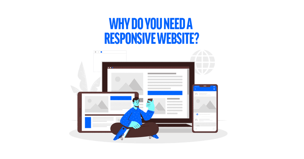
If so, you might be asking yourself, ‘Why should I waste time and money making my website responsive?’ The answer is simple, your audience is different, and they use different devices.
Here are some compelling reasons why you need a responsive website:
Mobile Traffic is Growing
It was stated before that over 60% of total internet users come from mobile devices. There were more people accessing their websites on mobile devices than on desktops. Then it is safe to say, you are able to shun over half of your possible visitors by not having a responsive website. Fast, easily navigated websites are needed by people, and that need is there regardless of the kind of device that they are using.
Enhanced SEO Strategies
Responsive websites rank higher in Google’s scale. Actually, Google introduced a mobile-friendly factor in ranking as of 2015. The search engine algorithm favors those websites that are optimized for mobile and broadband connectivity. Therefore, if your website does not adjust, likely you are going to be rated lower in search engine results and people may find it harder to access your web design company in Florida or business online.That’s why an SEO-friendly website is vital for staying visible in search results.
Increase In User Satisfaction
When users go to a responsive site, they need not squeeze and try to read the small text or do horizontal scrolling to focus on what they want. Everything from the text to the images is fitted as per the screen ensuring a better user experience thanks to the responsive design.
If users are satisfied, they are more likely to spend more time on the website and even browse through more of its pages in search of additional content.
Reduction in Cost
When designing a responsive website, you will not have to design the site in two versions, men and women. This single model gives rise to decrease in the time for development, the cost of maintenance and the degree of difficulty, helping companies and developers alike. It’s a win-win situation, especially for businesses like a Mobile App Development Company in USA that aim to appeal and serve a diverse user base.
Key Recommendations of Responsive Web Design
Actually, achieving responsive design is not simply about resizing text or images of a website. There are recommendations to the users of the websites about construction or reconstruction of the websites that should be followed in order to make it responsive and improving website conversion rate.
Start with Mobile Design
The most recommended thing for responsive web is to start designing websites for smaller screens i.e mobile phone. It’s better than going for big screens. Most of the technology users have mobile phones as their go-to gadget. Once you master it, you can go for bigger screens.
Set Breakpoints Wisely
Keeping phones, tablets and desktops experience different is most recommended by experts. Even with different pixel sets they have, creating a totally different experience is needed. So you need to work in each screen setting according to your website’s content and your custom software development company‘s need not on what’s default.
Make Images and Media Work Well
High-quality images look good on computers but can slow down mobile devices because they are large. Always make sure your images, online user interfae design, ux and other media work well on different devices by adjusting their size and quality.
Minimize CSS and JavaScript
Too much CSS and JavaScript can impact the performance of your site, but most importantly when viewed on mobile devices. This should be your code files themselves (i.e. the file you wrote), and all of them should have minified versions so load times are improved.
Embrace Touch-Friendly Design
So many people are going to interact with your website by using touch. Adjust buttons, forms and navigation elements so they are easy to use on touchscreens. This involves building bigger clickable regions and getting touch gestures to reliably work across a wide diversity of devices.
How to Turn Your Website into a Responsive One?

Before you can get started building or converting your site to a responsive design, here’s a step-by-step guide for that!
Start with a Fluid Grid
Any fixed-width layouts would be replaced with a fluid grid, your website should size based on percentages and not pixels. Use CSS Flexbox or through the use of whatever grid layout system you prefer to deal with how elements should be laid out dynamically.
Implement Media Queries
Use media queries in your CSS to change the design according to the size of the screen. That is, you may hide some element on smaller screens by using a media query or increase the font size of a text in order to make it easier to read on mobile.
Test Across Devices
Testing is crucial. Simulate different screen sizes via browser developer tools and test on real devices (preferably at least the most popular models/ OF systems). Use these tools to simulate how your site will look on different devices: BrowserStack, Google Chrome Developer Tools
Optimize for Speed
ENS is important considering not all mobile users have fast connections. Check Google PageSpeed Insights tools to understand performance of your site and suggestions to improve load time.
Ensure Touch Accessibility
Also, if gestures like swipe are supported and buttons are touch-friendly (i.e. big enough for a fingertip).
What are the Difficulties in Creating a Responsive Website?
Responsive design is a great solution to this problem, although not without some drawbacks. Some common problems you may face:
Browser Compatibility
Code does not always look the same in different browsers. For instance, a feature might work perfectly in one browser but break or cause functionality issues in another.
So, whether you are using frontend or backend web app development, the most important thing is to make your website work the same on every browser and hence for that cross-browser testing is a must.
Complex Layouts
Complex designs make it harder and harder to build a fluid responsive layout. A lot of the time you will have to add significant customization in order to make large menus, big photo galleries, or fancy animations look acceptable on a smaller screen.
Performance Issues
Since responsive websites need to work on a variety of devices it is imperative they do not get slow. These bars can be graphics heavy, full of JavaScript, or unoptimized code that are slow to load on already slower mobile networks.
Device Fragmentation
With so many devices out there, responsive design can get tricky. There are way too many devices to be tested, so you have to narrow it down to the most common screen sizes and resolutions.
Time and Resource Investment
It takes time, effort and sometimes more resources to create a responsive site initially. But this is not without its drawbacks — in the beginning there will be hefty investment and large websites with a lot of content can end up spending quite a bit.
Selection of backend language should be based on unique project needs. Ease use and powerful libraries for fast development and AI-driven applications has made Python a favorite among many developers.
Responsive Web Design Examples:
Responsive web design lets websites behave as they should (and look brilliant) on the full range of high and low resolution, color depth devices with internet capability, by automatically adjusting the layout to fit various devices. The most famous ones among the responsive web design examples are Starbucks and Airbnb.
Starbucks:
The Starbucks website is responsive across all screens including desktop, tablet and mobile. Their website layout simplifies when viewed on the small screen with simple menu navigation, touch-friendly large buttons and image resolution is optimized. This ensures that users always have easy access to the most important features, such as ordering coffee online or finding a store close by, no matter what device they are on.
Airbnb
Responsive Web Airbnb is also a nice example of it. While still preserving the core functionality and aesthetic, their site adapts automatically to various screens. The site remains clear and easy to follow, whether you’re looking for a place to stay or tinkering with your bookings. images, maps and listings all respond to the size of the screen that you are using to ensure a consistent user-friendly experience with mobile phone, tablet or desktop. Responsive design means better usability and more engagement; these examples illustrate how.
Amazon
It’s the largest e-commerce platform across the globe. Amazon has a really good site that adapts to any device the viewer uses, which comes handy for the users browsing or shopping. For smaller screens, Part layout becomes more simple on smartphones by stacking categories, using collapsible menus and resizing photos and text for better reading comfort. Large number of products and services but the website is easy to navigate and beautifully responds to different screen sizes.
Conclusion
In technological advancement, responsive web design is every business’s need rather than an option trend to follow. In order to gain popularity, prioritizing progressive web apps designs in mobile phones is a must. Your user will be thrilled to have easy-to-use and best layout features while scrolling through your website.